Standing Strong: Making a Mural
In 2017 Canada celebrated its 150th birthday. Communities across the country found different ways to mark the event. Here in Shelburne County, the Osprey Arts Centre sent out a call for submissions to design and execute the making of a mural that would invite community participation. I was the successful applicant and so the work of bringing “Stranding Strong” into reality began.
Sketch painting that became the design for Standing Strong
For me, the idea behind the trees in this mural and what made this subject matter so appropriate is actually the part of the trees that are not seen in the finished mural. It’s the structure of the roots and the way they intertwine that give this stand of birch stability and strength
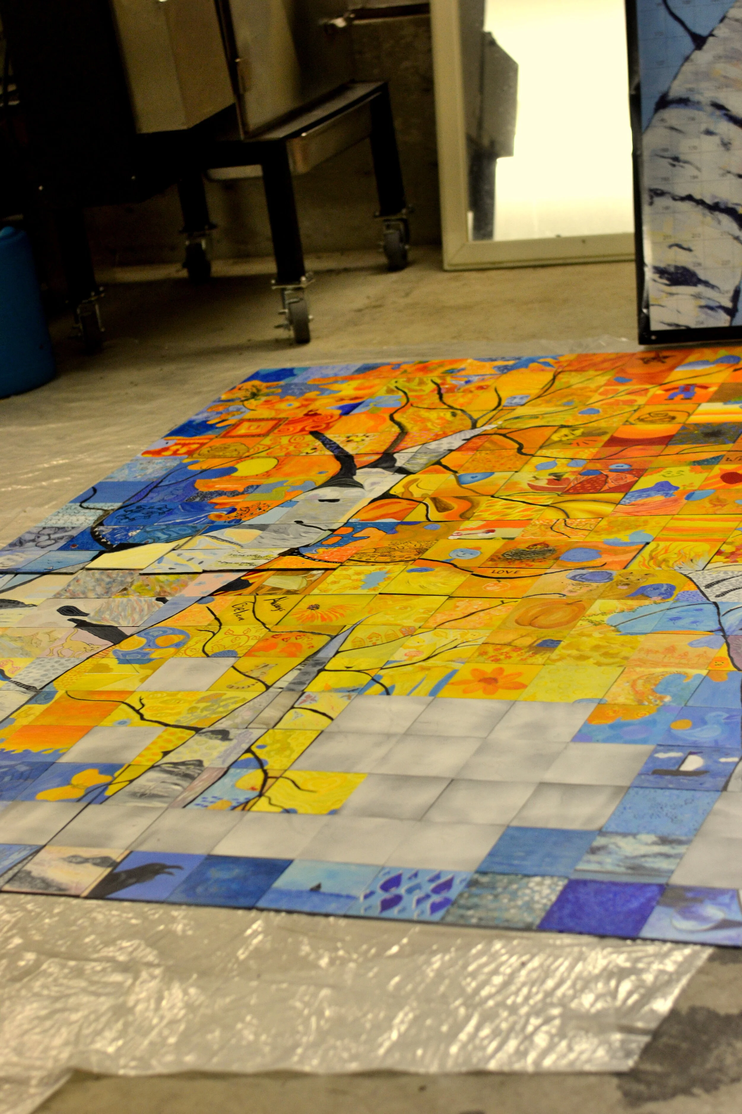
Each of the individual six inch squares, painted by members of our community have an impact of their own when viewed individually. But when you stand back and see the mural as a whole the trees come into focus and the individual panels are less distinct. I think this is what makes the stand of birch depicted in the mural a fitting visual metaphor for what a community really is. Each of us, perfect and complete on our own, coming together to form something unique and new: these trees with roots that intertwine, forming bonds that further strengthen the community.
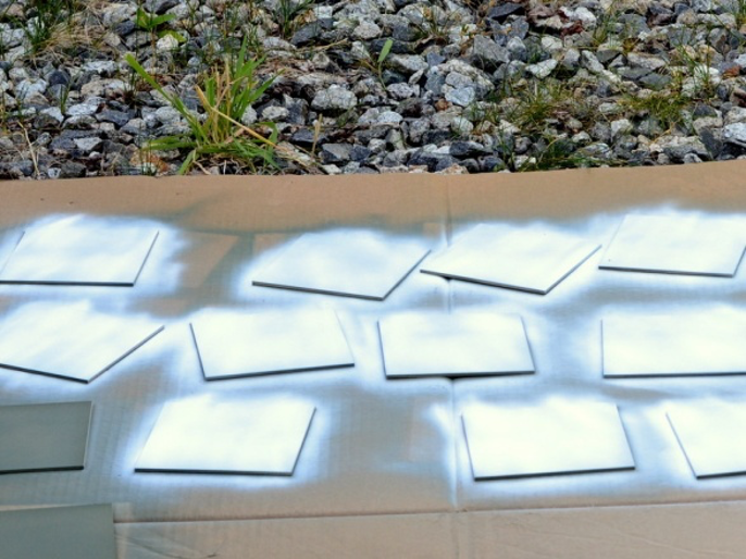
Each 6” x 6” tile was coated first with a brown coloured self etching primer and then a white primer (both types of primer were purchased at an automotive supply store and were suitable for use on metal). I elected to coat both sides of the tiles as it was to be located next to the harbor and would have to withstand salty fog, rain and general wet conditions. When the supporting substrate was made I did the same with it (both sides) before gluing the tiles into place.
Once the tiles were prepped each was numbered on the back and arranged appropriately. I then drew the outline of the design on each tile (in pencil) using the gridded poster as my guide. I also included minimal info about the colours to be used, i.e. light warm, dark warm, light cool, dark cool, dark and light pastel.
I had a large poster (behind the boy) of the mural design made with a numbered grid superimposed over-top. Each square represented one of the 266 tiles that made up the mural. I took this poster to each tile-painting session so participants could better understand where the tile they were painting would fit into the whole mural. This helped when I was explaining the scope of the project.
Workshops were organized and held at the Osprey Arts Centre, in my home studio and at the local Saturday morning Farmer’s Market.
Here I am at the local farmer’s market helping with the Standing Strong Mural Project to help celebrate Canada’s 150 year birthday
The substrate, shown below, on top of two saw-horses in my studio, was made using metal tubing for the frame with a sheet of aluminum welded onto this frame. I sprayed the self-etching primer (usually used on cars) onto both sides before affixing the tiles into place.
I also drew a measured grid and numbered the grid (same as I did on the poster) to aid in getting each individual tile into its correct position before gluing each one into place.
An official unveiling was held at the Osprey in November 2017. Here I am (feeling very happy) on stage with the finished mural. Many members of the community were on hand to celebrate with me.
Osprey Arts Centre, 2017
Here’s the completed mural. It was installed in its permanent location at the end of November, 2017. You can see how the substrate was all-around about 2 ½ “wider than the completed mural itself, so when it was painted black it made a nice frame for the mural. On the corners you can see the tabs (each with a hole drilled through) that were welded onto the 4 corners of the frame. Long bolts were used to secure the mural to the outside of the Osprey Arts Centre building.


